Many alcohol enthusiasts also happen to be aesthetically inclined. The wine and spirits industry has become a leader in fine design. Wineries and distillers have discovered that their target audiences (you and I) respond well to fine design, and even make purchases based on whether or not a bottle’s label is engaging.
Years ago, designers claimed album cover design was as good as it gets, but today, it’s the wine label. Within the boundaries of a few square inches, everything is explored: color, texture, diecutting, romance, whimsy, and so on. Photography was once off-limits with label design, but now it’s acceptable, at least with youthful brands.
Usually, when a new company hires me, my first job is to design their logo, but the alcohol industry is different. Its primary impression is made through the packaging (label, capsule, neck tag, etc.), and that is where I started with Building 43 Winery. In direct conversation with my clients, I pick up nuances that contribute to the success of the design process. Sure, I welcome creative briefs provided by marketing professionals—I sometimes draw them up myself—but usually, talking with the client provides the best outcome.
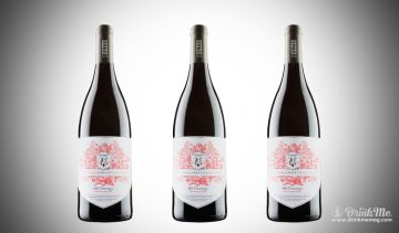
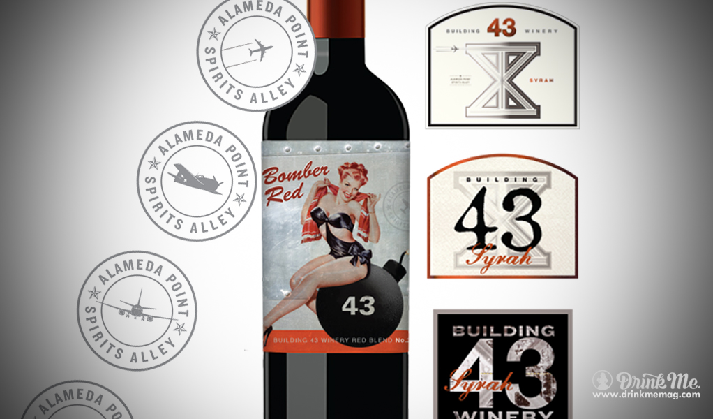
The designs shown here were part of my first presentation to Meredith Coghlan, proprietor of Building 43 Winery. Previously, when I met with Meredith, she emphasized one word: Urban. Meredith and winemaker Tod Hickman own a new winery housed in an old warehouse in the decommissioned Naval Air Station Alameda. There’s a big “43” painted on the outside of the building. This sparsely occupied area is surreal, yet it is also highly desirable; the San Francisco Bay is right across the street! Meredith is cleaning up Building 43, and she wanted me to design a label that captured its industrial character.
The best designs involve a concept or story that speaks to the intended customer. Fortunately for me, Meredith gave me a picture of the naval base’s runway in aerial view. I was thrilled. The runway forms the shape of an “x”—which gave me a great motif to start with.
The designs I presented to Meredith two weeks later all incorporated a stylized version of the runway or the actual photograph. As usual, the client had an immediate favorite that she eventually decided to go with, not a bad idea since first impressions are key with wine label design.
Wine label design, like any creative work, also has its share of tediousness. The Alcohol and Tobacco Tax and Trade Bureau (TTB) imposes strict rules. The front label must display certain information and specific type sizes must be used. To prevent cluttering up the label with dire warnings and such, the back label design is often presented to the TTB as the legal front. This solves a lot of problems, but there’s still the waiting process—it could take months to get the stamp of approval—and there’s always the chance that the label won’t pass the TTB’s test. I also determine other practicalities such as which paper and glue will withstand sitting in ice buckets –it’s a horrid embarrassment if the label easily peels off.
But back to the cheerier aspects of my profession that you, a fellow aesthetic enthusiast, may enjoy. Label design is a detail-oriented business. Precious details, such as an intricate border or lavish flourish, communicate the winemaker’s careful attention and the complexity of the wine itself. Official-looking seals found on wine and spirits labels may simply be a designer’s creation for the purpose of adding depth and detail. Take my Alameda Point seal, for example. I created it for Building 43 Winery to add interest to their label and highlight the winery’s location. Actually, I created at least five seals, shown here, each silhouetting a different type of plane that would have flown from the base. Meredith chose the fourth option with the tiny drawing of the Grumman F6F Hellcat, the navy’s best fighter for the last two years of WWII. Ah, details!
Additionally, wine labels are often interesting to the touch with textured papers, foil stamping, and embossed type. These embellishments invite you to feel the label. They urge you to connect the fine tactile details of the bottle to the taste and feel of the wine and its smooth finish.
Funny enough, my son, brother, and father are all brilliant physicists. Recently, a friend asked, “What happened to you?” I laughed, but creativity involves the intellect just as physics involves creativity. Even this frivolous looking “Bomber Red” label only came about after loads of research and experimentation. The girl, metallic background, and typography reflect the time period when the naval air station was in operation, when girls used to be painted on the nose of fighter planes to cheer up the troops. I made her hair red—she had been a blond but red really made her pop—and labeled the bomb with a “43” because we’re building a brand attributed to that number. It’s also a little visual joke: the wine is “the bomb.”
In case you’re wondering, I work on the computer, hours on end, though I keep notebooks and ink around to sketch ideas. I work in silence. Music would be nice, but it interrupts my concentration too much. Work is work, even when you love it. Hopefully, all of these efforts enhance the drinking experience of people who are both alcohol and aesthetic enthusiasts…people like you.


